Logo of the City of Ostrava
The genesis of the new city logo. The marketing symbol for the worldwide presentation of Ostrava.
For a long time, Ostrava had been using its coat-of-arms showing a silver horse with a golden saddle and a red saddlecloth rearing in a blue shield on a green field accompanied by a golden rose with green leaves between the petals and a red ovary. It is a traditional and popular emblem. Why did we decide to look for a new logo then? It has been shown that our traditional coat-of-arms gets lost in the mix of all the different types of logos and emblems during a number of less official events and often during commercial presentations. And when placed among them it loses its dignity.
The Pursuit of a New Logo
Until recently, Ostrava was one of the last big cities without its own logo. The previous city administration had initiated a competition for a new Ostrava logo. In 2005, a two-round competition was announced in which both individuals and firms could take part. 72 participants joined in, where each was allowed to send in a maximum of three designs. In total 150 designs were received. The second round saw ten of the most interesting designs from four agencies. In the end, however, none of the designs was convincing enough for the city council to gain their support.
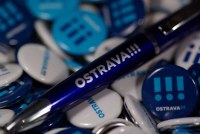
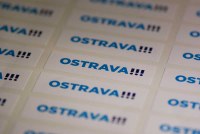
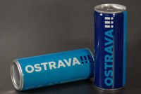
 In the autumn of 2007, the city approached Studio Najbrt - one of the best-known Czech graphics studios. The studio has made a number of logos for both Czech companies (PPF, ČD Cargo, Agropol etc.) and organizations; it is in regular cooperation with the Karlovy Vary Film Festival. Among other things, their graphic designers have designed the logo of the capital city of Prague. In this region the studio has worked with the Colours of Ostrava festival and also with Jarek Nohavica, whose posters and CD covers have been designed by the studio for many years. Within the first stage, Aleš Najbrt and co-designer of the Ostrava logo Boris Meluš submitted 6 design proposals, including samples of its usage on printed materials, promotional items and so on. The city council chose the winning design – the new logo of OSTRAVA!!! Late this April Najbrt Studio created a full graphic manual with a cohesive visualization of all the thinkable uses of the logo including such details as font, colour and other features. The design manual defines the font, colours and develops the whole visual side of the city into the smallest detail, such as the graphic design of the new web pages, business cards, headed paper, press releases, employee name cards, the labelling of city buildings and small promotional items.
 |
 |
|
 |
 |
|
 |
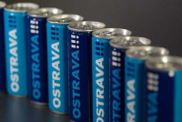 |
These small promotional items are also available for purchase at the Ostrava City Information Centre.
 |
The new visual style of the city was not only given to the approximately 40 city-funded organizations of Ostrava, but to all 23 districts as well. Among other things, it also concerns its public transportation vehicles. The new logo has been visible at cultural and sporting events supported by the Statutory City of Ostrava. The city obtained the logo, design manual and license for its unlimited use in both the Czech Republic and abroad. |
 |
|---|
Ostrava has a New Logo
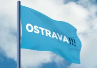 OSTRAVA!!! is the marketing symbol the city presents to the public in the Czech Republic and abroad. The heraldic emblem of the city will be used exceptionally during official occasions. The image of the logo is formed by the name of the city with three exclamation marks, which symbolize the vitality, energy and confidence of the city and its inhabitants. The light blue colour in the primary variant in the name OSTRAVA comes from the heraldic tradition and it is complemented by a dark blue colour to accent the exclamation marks. The logo of the city is non-traditional and slightly provocative, thereby capturing and lodging itself in one’s memory. Its graphic rendition also allows other colour schemes, but also allows the use of just the individual exclamation marks (just as the sporting brand Nike does).
